"A Redtail's Dream" comic drawing walkthrough, part 2 of 2
It's time for the second part of this little walkthrough of my comic drawing process, which is all about the digital half of it and even includes a video recording of the whole thing! The video is sped up to two times its actual speed and is less than 40 minutes long, which means I pushed through the whole ordeal in less than 1,5 hours. Since this page is only half the size of my usual pages, we could perhaps assume that a full size page would have taken 3 hours. That's a bit less than what I usually manage to pull off.
And here's the walkthrough! The stills are cut right out of the recording. The didital process is naturally a bit less straightforward in some places than the traditional part, so if you get confused you can just look up the part in the video. Asking me is OK too.
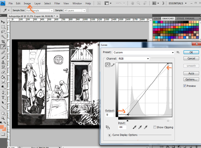
The first thing I do with every scanned piece of lineart is to make sure the white areas are white rather than light grey and make the dark areas a bit darker if needed. This I do in the curves window (nr.1 in the image below) by dragging the top part of the curve to the left to turn the light grey parts into white. The bottom end of the curve controls the dark values, and dragging it around adjusts their intensity. As you can see in the video, I also even out the brush strokes in the large, black areas by carefully painting some gey over them with a very rough and highly transparent brush.
After this I'm going to change the color of my lineart a bit make it less dull, because that's what completely black linearts are. But right before adding color, I'm going to make sure the lineart is completely and evenly grey, since my inks and varying types of markers all have slightly different hues of black that will show in the scan. I don't want the final colors to be off balance, even if no-one else but be noticed it. To do that, I go to "hue/saturation" (nr.2 in the image below) and drag the saturation slider all the way to 0.
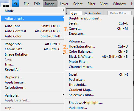
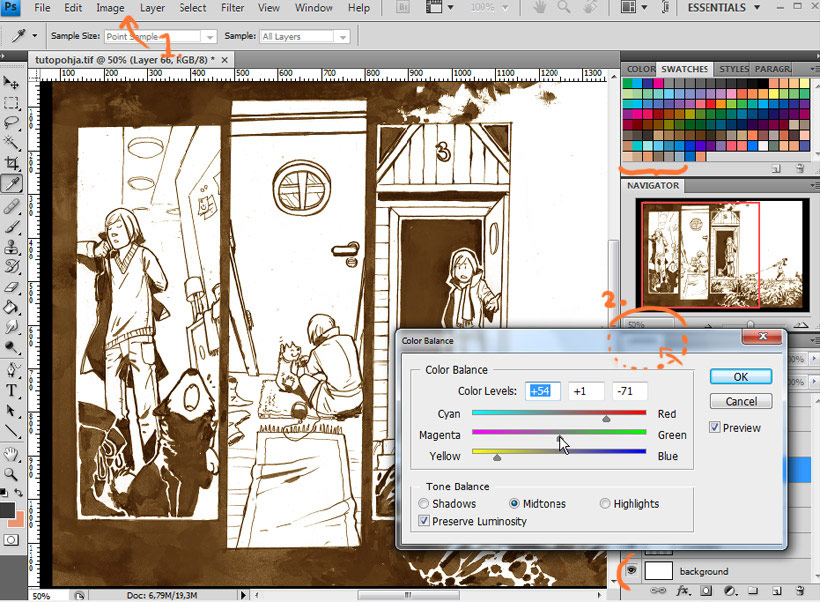
Then the colors. I go to "color balance" (nr. 3 in the previous image) and mess around with sliders. The colors won't be particularly noticeable in the end, since after setting the lineart layer to "multiply" the color values will be added to the colors below it and turn quite dark, except right on top of light colors. But it will bring some subtle flair to the image. By the way, the layer setting is changed into "multiply" in the little dropdown box (labeled 2. in the image) that's annoyingly covered by the color balance window in this shot.
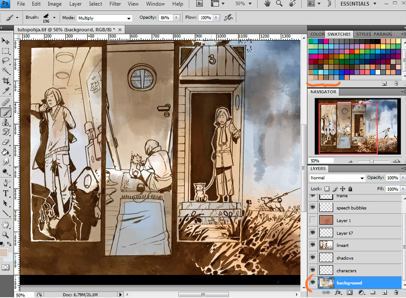
After the lineart itself is finally fixed up and turned to "multiply" in order to make it see-through, I throw in some quick base colors for the background. As you can see in this image I have a preset of layers set up for my comic page. I have a master file set up where I just paste the new lineart for each page and save it with a new name, so that I don't have to create each necessary layer over and over again. I've got layers for the background, the caharacter colors, character shadows, the lineart, a color+texture layer, black frame and panel borders, speech bubbles and a layer group for the dialogue. Most of the layers are just normal, blank ones, but the shadow layer is set to multiply and ~50% transparency, depending on the chapter I'm working on. More on that later.
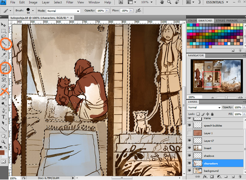
After the quick color mess for the background I start the flatting process, which means I color in the areas for the characters on its own layer. When I have a very difficult lineart with a lot of lines everywhere I just color it all free-hand with a brush, but often I also use the magic wand selection tool to help me stay within those lines. When there are large, blank and therefore easily selected areas outside my character linearts I select those with the magic wand and invert the selection from "selection"-> "invert selection". Then I won't be able to accidentally color in the area outside the character lineart! In the selection stage I also adjust the selection area a bit to push it slightly into the lineart, to make sure the colors don't bleed outside the lines. (se images below for the settings I use, tey're not exact in any way so feel free to play around with them!) By the way, in this part the fill bucket is just pointless, I just end up with tons of color in places you don't want any.

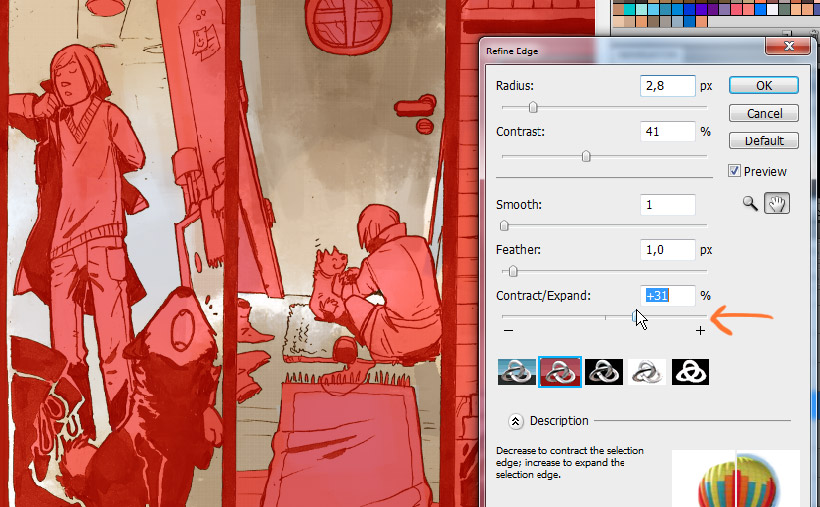
That's the selection settings. View the video and slow it down a bit/pause it if you're completely lost after my convoluted explanations about this part.
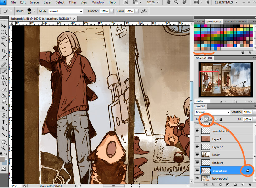
After the flat colors are done, I lock the layer (using the top icon that looks like a little square in the layers tab) and start manually drawing in the correct colors for each area. I've got the main colors (faces, Hannu's hair, clothes, Ville's fur) added to my swatches to make sure they're easily accessible and always consistent through a chapter. By the way, I noticed by watching the recording that I have a strange habit of first opening the color window and then choosing the color fom the swatches with the color sampler tool. That is dumb, don't do that! You can just click on the color swatch right away and it'll be selected. It's probably a habit left over from the years of digital painting when I never used swatches and just picked custom color through the color window.
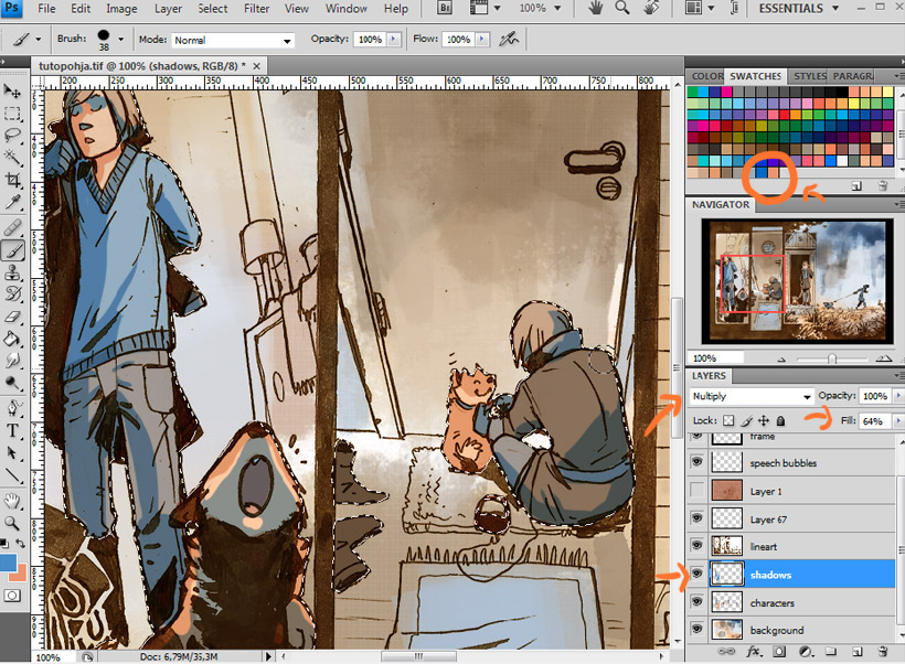
Now the shadows! Here I use the same magic wand selection tactic as before to shut out the area I don't want to accidentally draw shadows on, except this time I can simply select the area outside the colors in the "characters" layer in one click and inverse that. This "shadows" layer is set to "multiply" to make the shadows blend with the colors beneath, and the "fill" (or "opacity", doesn't matter which) is set to whatever I feel fits with the lighting of the chapter I'm working on. These are all personal preferences though, there's of course tons of cool layer settings that could suit someone else's way of drawing shadows better. Additionally I always have two swatches for the shadow colors for each chapter: one general shadow color, and one more suitable for skin shadows. To apply the shadows I just draw them with a regular, round brush wherever I feel they should go.
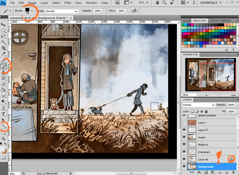
Finally I finish up the background. By now I've also added black, straight borders to the panels to make them look cleaner and to make an easily selectable area. In the video you can see how I select the insides of each panel border, expand the selection a bit, copy the background withing that selection and paste it making new layer. When I lock this new layer (It's the new layer with the exclamation mark drawn on it) I'll be able to easily paint on the background of the small panels without accidentally slipping over the borders. To paint the backgrounds I use a square brush so that I'm prevented from trying to paint unnecessary, time-consuming details and to keep it all a bit paintely.
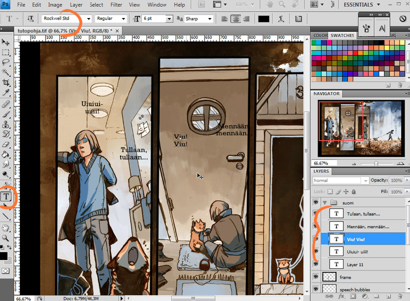
The coloring part is now all done, so it's time for dialogue and speech bubbles. My master file includes a layer group with one empty text layer that only contains my font settings for the comic. Since the file I worked on for this walkthrough was a bit smaller than my usual pages the settings weren't quite compatible and you can see me fiddling with the font size and line spacing in the video.
I keep the text layers inside layer groups to keep the layer tab as clean and organized as possible. Since I do the dialogue in two languages I'll occasionally end up with dozens of text layers that will make the layers tab really difficult to search through. Here's the Finnish dialogue first, with its own layer group named "suomi", the English dialogue group wil naturally be named "eng".

I write the English version of the dialogue right on top of the Finnish one, this way I can make sure the dialogue snippets end up having a similar-ish shape. For dialogue shape, I always try to make them something between round and square. I don't want the upper and top rows to look too short compared to the longest ones in the middle, and I don't want the word ballons to ever end up being noticeably narrow in either direction. The shapes of the dialogue snippets are regulated by just making line breaks where needed, so with long pieces of dialogue it's a bit of a back and forth experimentation about where the line breaks should go.
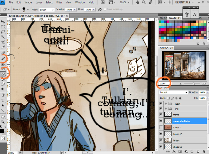
Word balloon time! I just draw them free-hand with a regular round brush and zoom in to 200% to make sure the lines are smooth.
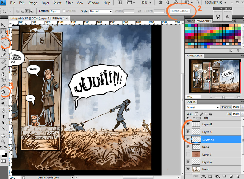
Then I fill in the speech bubbles by selecting the insides of them, expanding the slection a bit as always, and using the fill bucket on a layer beneath the bubble lines layer. I also made one layer where I dre Ville's sound effect-like howl, so I've got three layers in the end, usually I only have two.
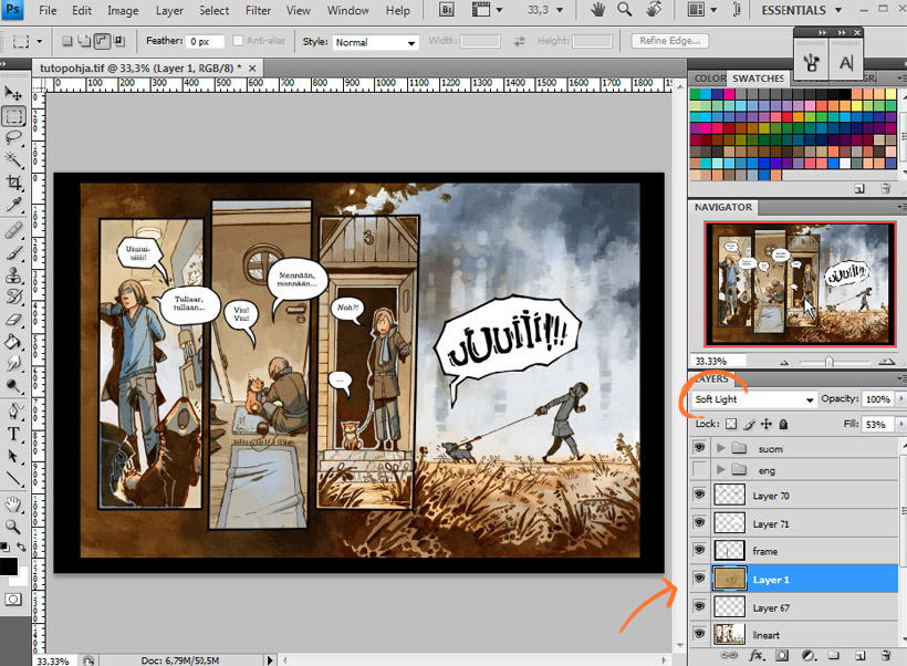
The last thing i do before the page is declared done is to turn my color/texture layer visible to push all the colors in the image into a more similar and harmonic range. The texture is a very faint watercolor mess I painted myself years ago and scanned in. Its purpose is to make the completely flat, digital-looking color areas of the caharacters slightly uneven so that they don't clash too much with the hand drawn lineart, but it's a very subtle effect, barely noticeable. The texture itself has a color that I've added the same way I add color to the lineart (see the beginning). The layer is set to "soft light" and usually has about 40%-60% fill to make it very gentle.
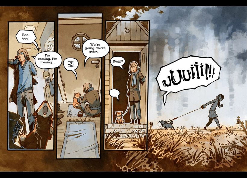
Well, we're done here! I of course save a second file of the page that I resize to fit my site layout and make sure I move the original, large file with all layers in place to a safe back-up place outside my computer. The end.
Questions, comments, suggestions, alternative solutions and all that other stuff is of course very much welcome as always.

