


Stars Tutorial
for which you'll need no crazy custom brushes. Photoshop CS4 is the program I use, but any modern, decent painting program will do as long as you are familiar with your tools and use a bit creativity with your solutions when need be. Ah, yes! You'll also need a scanner, perhaps a camera will work as a substitute.
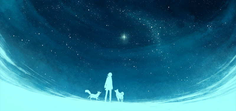
"Stars are pretty" is a truth on par with "kittens are adorable", which means that everyone who disagrees is probably a zombie in disguise, or that crazy bum who yells at people at the train station. But assuming that you're neither of those, let's learn some tricks how to paint a neat starry sky without completely exhausting ourselves, and without any fancy brushes. This will be a walkthrough of the picture seen above, follow the link to see the larger version which is in the gallery.

Before drawing a single star we need to create an interesting foundation to place them upon. Simple start: a color gradient, with a dark color on top and light at the bottom. You know, the sun lives beneath the horizon during the night and all that. We also see a greater deal of atmosphere with all the little reflective particles in the horizontal direction than when looking upwards, there's just black emptyness up there. Doesn't really matter what color you use here, blue is the most obvious one but I've seen some amazing night sky depictions in virtually every color imaginable. Maybe not yellow, but that could be a fun little experiment. One almost definite no-no, unless you really know what you're doing and have a good reason for it: avoid using pitch black at this point. If you feel like having completely black areas you can add those later on, but let's keep things light for now.
It doesn't matter how you create the gradient, as we'll paint a lot of stuff on top of this before the foundation is done. The paint bucket tool will probably be a-OK, even if a lot of people completely despise that tool. I think I just took a gigantic, round, soft paint brush with the opacity turned way down and drew a few strokes of lighter blue on top of a dark blue background.
If you have a foreground, put it on a separate level. If you don't do this, you'll just end up accidentally painting over it and then you'll cry.

Huh? What happened here, and why? What happened is that we've made our foundation way more interesting and three-dimensional, because interesting=good. If you only want to draw a starry sky with absolutely nothing but a smooth sky and the stars on top, feel free to skip to the next part. But beware, that painting might end up as dull as a bowl of whole grain cereal with no milk or fruit.
When looking at a clear night sky the bare human eye isn't able to see much more than the darkness and the dots of light, but there's so much more going on there. Browse through some night sky photography taken by professional photographers, and you'll see everything but a smooth surface with a few dots.
For this particular picture I wanted a slight fog in the atmosphere, thick enought to be seen and enhance the feeling of space, but not enough to seclude the view of the stars. I've used two tools for this part: my usual soft, low opacity, regular round brush, and the smudge tool to give my strokes s fluffy, dreamy finish. I keep the strength of the smudge brush low enough that it doesn't leave any obvious streaks, and my way of handling the tool is in no way random or loose. The smudge brush isn't some magical tool with which you automatically get a neat result, it's something you'll need to carefully learn to use. And even then it will take patience and focus to get the result you want.
But you don't need to use the smudge brush just because I do! If you have any cool custom brushes lying around which you feel would give a nice result, go ahead!
Now for the last part of the foundation, maybe the most fun one. Because we want space dust, traces of barely visible nebulas and galaxies in the far far distance! And what's a good way to get a random, organic and rich noise on top of everything? Well, it's time to step away from the computer for a while and paint for real!
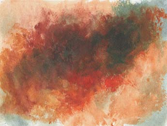

That's my five'minute acrylic masterpiece, painted on A4 watercolor paper. For a rough texture you'll want to use a large, hard paint brush. No delicate watercolor brushes with their soft tips, we want grunge! If you don't have a brush like that, be creative! Grab a rough, old sock and slab some shoe polish on it if you feel like it.
As you can see, after scanning my masterpiece (for spring's sake, let the paint dry before putting it in your scanner!) I then inverted the colors in photoshop, because I felt like having the dark parts on the edges would suit the image better, and made it a greayscale image. We're going to place it as a separete layer on top of the painting, and if it's not all in black and white the color of our new texture will of course affect the colors beneath. Some times that's pretty cool, and I urge you all to experiment with it, but for this I've decided to keep things clear and simple.
But yes, a new layer! More importantly, a see-through layer. What you'll need to use for this is the layer setting called "blending options". In photoshop it is found either through layer->layer syle->blending options. A faster way to access the same is simply through the layers window, if you have that visible. The dropbox for the different blending modes is right on top of the window, to the left of the "opacity" setting. The default setting here is "normal".

Once you've found the blending options, there's only one thing to to: experiment with all of them until you've found one that suits your purpose the best. Remember to play with the fill or opacity settings too (no idea what the difference between those two is supposed to be), as it changes the look of each blend mode a lot. I can't tell you what the general idea between the different blending modes are, some of them are pretty damn weird while others are more subtle, and frankly, more usable. As you see, I've settled for the one called "soft light", with a fill of 34%. This setting is probably the most subtle one; it doesn't really change the colors at all or create annoying saturated blotches.
And this is what we get, our final foundation:

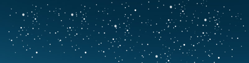
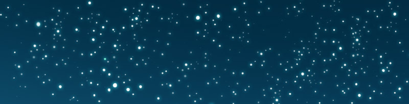
Finally, time for some stars! But not interesting, brilliant stars in cool formations or constellations. Nope, what we need to do first is the most boring part: a blanket of tiny, dull, blue stars in the far, far distance. Almost looks like the sky has chicken pox at this stage. You'll definitely want to make a new layer for this.

Here's a close-up of what the stars look like:

The big question at this point is of course: so do I just draw a few stars and copypaste them over and over again until I've covered everything? Yes, and no. Yes, copypasting is the best way to go, as these stars are pretty insignificant and drawing each of them individually won't really make the end result better. But no, it's not "just" copypasting. Here's how you get the best result, without unnecessary manual labor.

First, draw a cluster of stars. Keep the pattern random and loose, vary the size and strength of the stars. The more stars you draw at this stage, the less editing you'll need to do next. To cover a giant sky of stars, this kind of tiny blurb won't get us anywhere.
Then we copypaste! Keepind the edges of the cluster loose in the first stage makes it easier to place the pieces in a well chained continuum. You'll probably want to flip a few of the pieces to reduce the amount of repetition.

We'll most likely end up with the ugly backside of copypasting: the repetition of obvious patterns. Some times they might be hard to spot, but once a viewer stumbles upon one of them, it becomes a game of "find the boo-boos" and the patters become visible everywhere! I've seen some pretty awful examples of this, where it seemed like the artist just drew ten stars and then tried to paste those into "random" patterns all over their website banner or whatever. No amount of added glow or textures will cover up that kind of lazyness.
As you can see, the main issue I've ended up with are these adjacent two stars. Once you notice them, you can easily find a whole bunch of annoying patterns all around them.

The way to fix this is to simply go through your whole starscape to both remove stars with a vengeance, and by adding new stars where it seems necessary. This is a tiring part, and the part where you'll wish you drew a larger set of stars from the beginning instead of copypasting such a tiny cluster.
Okay, so if we end up going through this all manually anyway, was there even a point to copypasting in the first place? Yes, there is, in the end this way of doing things does save a lot of time. I've tried doing it both ways, and manually drawing every single star takes easily twice as long and doesn't even look better in the end.
At this point someone might ask: "What about star brushes that create random patterns of dots? Are they no good?" Frankly, I have no idea, I don't use those kinds kind of "automatic" brushes because I find a self-serving pleasure in doing thing "by myself" so to speak. But if you find a good brush which you want to use, do that and enjoy it. In the end, the result is what most people are going to count.
Now, it's time to make things pretty. Make another new layer, we want to keep the pretty stars separate from the boring stars.

If you compare this picture with the previous stage, you'll notice that it looks remarkably different, no more chicken pox-sky. Almost as if I've skipped a stage somewhere. What happened is that I've now gathered all my focus and manually drawn a whole bunch of more vibrant, larger stars in specific clusters across the sky. I've taken advantage of the patterns that already existed in the foundation, making the stars cluster in the lighter areas and leaving the dark areas empty. This has an enriching effect on the color palette by strengthening the light areas (and I believe I may have made a few areas in the background darker), even if we still only have different shades of blue in the mix. I lucked out with my texture as it formed a hint of the milky way on the right side after flipping it, so that's where I made the stars have their largest concentration. Other than that there's some random constellations and clusters here and there.

In the close up you can clearly see how the smaller stars are blue and vary in opacity, while the larger ones are closer to a pure white. In the beginning I suggested that you do not use complete black anywhere, and I'm going to give that same advice about using pure white. With such small objects on such a dark background white will easily start looking grey once zoomed out. Leave a hint of vibrant blue in there, maybe turquoise or even green to counter the effect.
You know what's a good idea at this part? Taking a look at a map of the sky and drawing some actual, real constellations hidden in there somewhere. Could be fun for the occasional viewer who can then go "ooh, hey, there's the Orion! I wonder if there's more?". There are, of course, none in this image since Hannu and Ville are looking at the stars from a waaay different angle than what we're used to here on eart. And before you looking for hidden constellations in any of my other paintings, let me assure you that there are none. I never think of drawing those before I'm already long done with the painting. So that's some advice I can't seem to follow myself, hm.
Now, let's make those stars glow! First, I'll show you a way which I do not use, but which is very fast and useful in some situations and styles. Select the layer on which your large stars are on, and open the "layer styles" window, which you can acces either by right-clicking on your chosen layer and selecting it in the menu which appears, or by going layer->layer properties in the main menu.

Here we select the "outer glow" section, and start messing around. As with the blending modes (oh hey, we've got a blending modes-dropbox here too!), you'll need to experiment on your own. I've circeled the setting I find the most useful to help narrow it down. The color is probably the most obvious place to start. For a glow, you'll want a bright, light color, but not so light that it overpowers the stars themselves. The "spread" and "size" variables are something you'll need to experiment with quite a bit, and they affect each other. For example, If you want a large, very soft halo of light, you'll need to make the size large, but keep the spread to a minimum. If you on the other hand want a more compact circle of light with a sharper edge, make the size smaller and the spread larger. And everything in between! The size of your image will of course play a role too, the above settings with 8px in size will look way different on a smaller image. And this is what you get with the above settings:
It's kind of pretty, but it's very mechanical. I don't like using the "outer glow" for the starscapes I draw, the endgame is kind of boring. But the setting is incredibly useful for one thing, which I recommend for everyone: as a substitude for the "stroke" setting in the same "layer properties" window. Whenever I want a border on a text or a shape, both custom drawn or a real, vector based font, this is the way to do it. The "stroke" setting will give you a sharp, occasionally jagged line with very poor editing options, while "outer glow" will give you the possibility to get amazing, clean borders of any color, level of sofness and weight. While the name might suggest that it's only suitable for to create a glow, you can actually make the "glow" dark by switching the blend mode (which is set as "screen" by default) to either "normal" or one of the darker settings.
Aaanyway, back to the stars, and the way I prefer adding some glow to them, aka manual painting style which doesn't require photoshop:

It's the same as always: the round paint brush, with really soft edges, a bright, light color, with the opacity and flow settings turned way down. All there is to do, is to draw a few strokes of light where it feels natural, which is around the clusters and any unusually large stars. Don't go overboard with it, keep it subtle. The star pattern is the exact same as in the example before, yet the result is clearly different. I find this one more interesting and suitable for my style, but someone else's opinion may very well differ.
Ooh, hey! We're done! I've fixed up the foreground, and since this was a illustration for the comic I threw the Northern star in there too. I've also adjusted the color's a tiny bit, which is sometimes good to try out in the very end. I've used the methot of layer->new adjustment layer->color balance, from where I've added a teeny-tiny bit of green and cyan to the whole thing, and I also separately changed the foreground color to a more outstanding turquoise.

That's it, final close-up. How long did this take, half a day perhaps? Don't be concerned with the time, it takes as long as it takes. Some people are probably able to whip up stuff like this in an hour, while others, especially those who don't have much experience yet, will need way more time. And obviously this is only my way of doing things, there are probably tons of paths to achieve the same or even better results, solutions which I simply haven't discovered yet. If you find some other artist's advice more suitable for your needs, follow that and forget all about my blabberings.
Ah, such a simple picture, but in its simplicity it found many uses. Other than this tutorial, which was its original purpose, it turned out to work quite well as the main banner in the comic reader interface, and as part of the banner on the facebook page. Because stars are pretty, and if you don't agree you are a zombie. Or that one crazy hobo at the train station.
![]()
Things, stuff and junk on this page © Minna Sundberg